Monday, 21 December 2015

Life's a Pitch: Market Research

Vice Magazine


I suppose Vice was the initial starting point when we got talking about Sad Mag - it's so cult-ish and has a really big circulation so it was the thing that everyone kind of knew. We all agreed, however, that for all its strengths - it's self-knowing, punch, gross in a cool kind of way - it's just a bit much.  Although with Sad Mag humor and self-deprecation would be necessary, I would hope that it would something far subtler than Vice. 

UK Circulation: 80,000
Available through most independent book/magazine stores, but also through some high street retailers such as W H Smiths. 


Oh Comely magazine
A lifestyle magazine, and obviously quite different in tone to what we envisage Sad Mag being - far more in line with Kinfolk/Cereal etc. However, they do take on a different theme every issue, with all the content being based around that theme.This is an interesting feature of what could otherwise be quite a samey magazine. Good pictures though. They also have great reader interaction, and encourage readers to send in hand written letters/postcards. Also have the option via their website to sign up to a subscription box, so you get a mystery parcel through the post with each issue. We have discussed the idea of 'sad boxes' - could be something there.

UK circulation: 20,000 -so a much smaller and therefore more realistic source of inspiration than Vice
As with Vice, is available through independent stores as well as through high street seller.


Bad Day magazine


There's definitely something to be learned from this look; it's so simple but very effective. The tear drop in the corner is a nice touch. When we first realized that 'Bad Day' was a thing, we originally worried that our idea was be too close, so as to seem derivative, After some research we realized that they are actually nothing alike, and Bad Day is actually just a broad arts & culture magazine, just the whole 'bad' idea just being part of a visual identity. Strong aesthetic though. 


The Sad Ghost Club

Not strictly a publication, but an illustration collective (however, they do frequently self-publish comics and zines etc). Slightly more 'serious' that what Sad Mag would probably be, dealing with very 'real' issues such as making friends, coping with anxiety, however it is still valuable to see how the message of 'sadness' can be communicated in different ways. Also Sad Ghosts Club has a really strong collective identity, and a huge internet following. They can often be found exhibiting at comics festivals and zine fairs. 


Shite Shirts


Jon pointed us toward Shite Shirts, and it's actually been a great source of inspiration. Obviously Shite Shirts is not a publication company, but it has the ethos we want Sad Mag to have. There's something weirdly joyous in the celebration of rubbish things, 

Wednesday, 2 December 2015

Hit. The. Wall.

I feel like I've ground to a halt. This author brief, and everything I'm not doing with it, is occupying all my thoughts and all of my time. I have only managed one minor responsive brief and, although I have now read two of the three Random House competition books, I still don't feel as though I am moving forward. COP is sitting stagnant. Feeling very useless and unproductive and uncreative. This too shall pass, I guess.

Monday, 30 November 2015

Sad Magifesto

How sad are you? Sad Magazine takes a sideways look at the grimness of modern life. Sad people value the 'just okay' because sometimes that's enough.

This was a really enjoyable and useful session. The more we discuss this idea, the more I feel that we may have actually hit on something very exciting. Perhaps this excitement is just due to the fact that I a interested in the publishing industry anyway, and that is where I can see myself heading in the future, but I'm glad we all seem to be genuinely invested in the concept of Sad Mag.

We didn't manage to get together over the last fortnight because of external circumstances getting in the way, but have all agreed to set aside Monday afternoons, from now on, as a time for us all to regroup, catch up, and move forward with this project. We have also put a group messaging platform in place so we can keep communicating over the Christmas break!

Life's a Pitch: Sad Mag buisness concept

What is your business idea?

Sad Mag is a publication that takes a sideways and celebratory look at the grimness of modern life. Has a focus on good design (and is a nicely put together, well thought out object), but is not about design.

How did you come up with it?

By chance - the words "a sad magazine" just came up in conversation and we all agreed that they were funny, and had a certain melancholic humor, and this collection of words just seemed to generate ideas. A lucky strike!

What excites you about  it?

  • It's exciting to put something creative and cared about out into the world, that is not just for an audience of creatives. We want Sad Mag to appeal to whoever needs it.
  • The idea is quite broad and as such has room to grow, change, adapt.
  • An excuse for lots of play! We all agreed that it would be nice to tackle something with of humor and self-awareness, as it would push all of our practices in a different direction.
What industries do you belong to?
  • Publishing/indie publishing
  • Retail
  • Entertainment (?)
What improved/new features do you provide? Something better? Something different?

We hope to provide something that is humorous, raw, and self-aware, but that is perhaps a bit subtler that a competitor like Vice, which is far brasher in its approach.

What/who is the market?
  • People who like to invest in publications
  • People who can laugh at the world, at others and, most importantly, at themselves.
  • People who are fed up with 'aspirational' lifestyle magazines.
Who are your competitors?

Other 'nice' mid-range publications with a lifestyle focus


Life's A Pitch: Sad Mag

Although we started out with an idea for a publication that would celebrate young, up-and-coming talent, this quickly slid into territory we were all unhappy with. We realised that a publication of this sort would have to be a not-for-profit publication, and therefore we couldn't charge for it, and thus couldn't actually sell it. This got us looking at non-profit business models, and how we could distribute/circulate our publication to the right people, so it would have any form of impact. We started thinking about the role that the web could play in this, and creating a forum/online community. However, we all realised that none of us were particularly excited about this idea, and it had become so far removed from our original intentions.

After we hit this wall we decided to take a step back to look at what we were really interested  in - publications. Obviously, publications is a very broad field, and as we knew we would have to find an interesting and marketable USP (unique selling point), we started talking about niche publications, publications that had an essence that filled a specific market gap but without being too specific, as we thought that something too specific could mean that our ideas ran dry pretty quickly.

The idea that we arrived at was 'Sad Mag'. Someone mentioned a "sad magazine" as an offhand comment, and we all seemed to agree that this was actually a very funny and engaging idea. Sad Mag wouldn't actually be that sad at all, but would be self-knowing, and slightly tongue-in-cheek. A sideways look at the grimness of life for the modern young.

Business haiku:

Good pictures, bad feels
Have a salty laugh, it's great,
The future is bleak

Thursday, 19 November 2015

Thought Bubble

Spent the weekend with some illustration pals manning the LCA table at Thought Bubble, and it was really good fun! We managed to sell a good number of zines and has some really positive feedback about the high quality of the things we had with us.Got the opportunity to talk with a lot of interesting names, some that I already admired and was keen to meet, like Eleni Kalorkoti and Matt Swan,  but also some people that I wasn't aware of before - Dan Berry AKA Things by Dan is a true gem.

It was really nice to see some of Level 6 having success with their stalls as well. I don't think that I'd try to make my work to Thought Bubble, but I'd definitely be interested in working as an official volunteer next year. A weekend well spent.

Monday, 9 November 2015

Study Task 3: Sectors and Services


Veronica Lawlor's reportage illustration of 9/11

Lawlor was the only artist the draw on-the-spot on September 11th 2001, as the towers came down. These pictures were later exhibited in  Newseum, America's  national museum of journalism. Newseum itself is part of the Public Sector as entry is free of charge to the general public, and states its mission as being to "raise public awareness  of the important role of a free press in a democratic society". 

Of course, these illustrations are inherently part of the creative industries as they are creative endeavors, however, could they also be deemed as a part of Quaternary sector, as they are associated with a major event in modern America's history, and have been displayed to the American people free of charge, as a means of public education. These drawings have since been compliled into a book - September 11 2001: Words and Pictures, this could mean that is has also become part of the Tertiary sector, as a piece of publishing designed to sell.


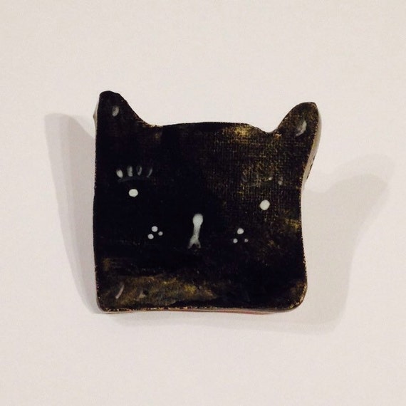
Ceramic cat pin badge by Alex Sickling

Sickling works as a freelance practitioner, primarily within the 'crafts' subsection of the creative industries. As her online shop provides a service designed to generate a profit for her gain, it is part of the tertiary sector. I would hesitate to say that these small pin badges could be included as part of the fashion industry - although they are wearable items - as they are not produces via mass production, and are only retailed through Sickling's personal online store. 

Sickling has quite a strong online presence, across several internet platforms. Her output also falls neatly into the recent resurgence of the handmade, industry. This could be seen as a success on her part, however it could also mean that her work runs the inevitable risk of trendiness, of becoming a bit diluted by a mass of similar work.


Concept art for Studio Ghibli's My Neighbor Totoro

Having been produced for an animation studio, this concept art is an example of Digital Film and Animation as a discipline within the Creative Industries, as well as being included in the entertainment industry and, by extension, the Tertiary sector.
Obviously, Studio Ghibli are a massively successful company, and My Neighbor Totoro has become a cultural icon, widely regarded as both one of the greatest 'world' films ever, and one of the greatest animated films ever.


Editorial illustration by Laura Carlin

This illustration, accompanying an article entitled Inside a Rape Trial, appeared in The Guardian newspaper, therefore is included in the Tertiary sector of the service industry. As a paid-for newspaper, this illustration also sits within the Private sector.
As part of the Creative Industries, I guess this illustration is in the 'publishing' sub-domain. 

This illustration as a piece of visual art can be measured as successful as it was the illustration that Carlin was awarded the V&A Editorial Illustration award for in 2006.


Character design for Nintendo game Animal Crossing

Animal Crossing is a game designed for and published by the games giant Nintendo, making it part of the Tertiary sector, and part of the game sector of the Creative Industries. It could also be called part of the 'Software, Computer Games and Electronic Publishing' sub-section of the Creative Industries, and could it maybe also be included as Animation (though I'm not sure about this one?)

The Animal Crossing game franchise has been both critically and commercially successful, having sold over 23 million units worldwide, and making a lot of money for Nintendo. The game has also had a cultural impact, and several of the characters now exist across various Nintendo game platforms.


Friday, 6 November 2015

Zine finished!

Got my zine all printed, finished and ready for Thought Bubble. I'm actually quite proud of this, and took a lot of care (maybe a bit too much - could that time have been better spent else where?) putting it together. I'm using so much ink at the moment, both in this and in 504, and really really enjoying it. Hopefully this is marking a bit of regeneration in my practice, I intend to keep pushing it, and learning about what I can do with it as a medium.


Tuesday, 3 November 2015

PPP 02/11

Today's session was to get us thinking more about illustration applied to a wide variety of jobs, existing in the real world.


It was great to get started thinking about Life's a Pitch as well, as I think I'm part of a really strong team, made up of a dynamic group of individuals, all of whom have different interests, skills, specializations and opinions,. I think that together we have the chance to really get a lot out of this. 


Sunday, 1 November 2015

Reflective Practice and Professional Contexts: III

Character and Narrative:

Tintin (and Snowy) - protagonist of Hergé's The Adventures of Tintin comic series, one of the most popular European comic book series of the 20th Century. The character has since gone on to appear in cinema as well, and is still widely read and respected the world over.


Microsoft's Clippy - The original computer mascot. Clippy's role was to aid users of Miscrosoft by communicating directly with the user, in response to coded prompts, to make the user experience as accessible as possible.


Animal Crossing - Characters from a Nintendo game. Video game design, a virtual world to entertain


Studio Ghibli concept art - preliminary concept art for the animation studio, with the purpose of informing the animators, and helping to generate new ideas.


P R O D U C T  &  P A C K A G I N G 

Charlotte Mei's 'ceramic selfie' 
Personalised cermaic knick-knack/3-d illustration for decorative purposes only


Mr Bingo's Camden Ale design
Eyecatching label design, a promo tie-in with the Hate Mail series, to entertain (?)


Carson Ellis' cover for The Decemberists' album Castaways and Cutouts. 
Album artwork


Pin badge by Alex Sickling
Found in her gift store/online shop, to be worn but also decorative?


Tote bag by Julia Pott
Fashion/textiles, functional - to be used/worn/storage etc


E D I T O R I A L   &  R E P O R T A G E 

Veronica Lawlor - 9/11
Reportage illustration made on the day of the 9/11 attacks in New York City. To communicate the truth of the spectacle. These drawings were taken on-the-spot, as the towers were falling.


Lizzy Stewart for The New York Times 
Editorial illustration, to accompany an article about the rise in couples attending sex therapy sessions


Oliver Kugler - reportage illustration about the inhabitants of London's East End, to inform. Published in The Guardian in 2006

Laura Carlin for The Guardian. Editorial illustration to accompany the article 'What Happens Inside a Rape Trial'. Printed page.

George Butler reportage illustration, to accompany a report on the 2012 Syrian conflict


Monday, 5 October 2015

PPP Study task 1

Things I've learned so far on the programme:
  1. It's okay to get things wrong - This time last year I was so scared of making any mistakes, so scared of my work being 'wrong' in any way. I think I was so overwhelmed by the standard of the work around me when I first arrived, that I felt I couldn't get things wrong for fear of not making the cut, getting left behind. I now realize that the best work often comes from the most mistakes, the most attempts, the most refinements. This is still something I struggle with sometimes, and I still find it disheartening when things go wrong, but I'm now far most accepting of process, as opposed to just finished product.
  2. An individual tone of voice is something that can only develop over time - Again, when I first started on the course, a constant source of frustration was that I felt my work didn't have a specific style, as if someone couldn't pick it out as mine in a line up. I actually think that I've made huge progression with this, and that the work I produce now does have qualities that make it distinctly mine, however this is something that only started happening when I stopped searching for a 'style'. It can't be forced, it just happens as a result of constant drawing and trying and learning.
  3. Do not fear that which you do not know yet - I started to really utilize digital process in my work toward the end of last year, which was something I was always hesitant about. I've learned that using digital techniques and process to refine work doesn't mean the work has to look flat and 'digital'.
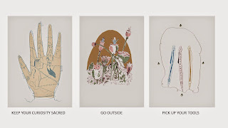
  4. Keep your curiosity sacred - The way to produce the best work is to imbue it with what you learn from remaining engaged with the surrounding world. 
  5. A work/life balance is important, too much of either will result in a crash-and-burn - this is something I learned the hard way, but it was an invaluable lesson. Hard work is mandatory in this field and on this course, but it is still okay to leave your work-thoughts in the studio at the end of the day. Trying to do too much will result in wearing yourself out, and losing all sense of organisation and perspective. Stressing too much will always come back to bite you.
Things I want to know more about:
  1. Different analogue forms of image making, especially printing - Although I can know use digital process in my work fairly competently, I'm still most fond of analogue processes, and would like to find ways other than just drawing or painting on paper to expand my analogue practice. I'm currently taking evening classes in ceramics and really enjoying it, and I hope this is something I can build upon in future.
  2. Digital processes - That said, I would like to continue to better my digital skills, as I realize they are really a mandatory in today's industry. 
  3. What space there is for the things I'm interested in within today's creative industries - a realization that I came to toward the end of last year is that I don't want to try and be a full-time jobbing illustrator. Of course I love illustration, and very interested in the place of illustration as a whole within the arts scene, but need to continue looking for exactly what it is I want to do, whether that's looking into arts publishing, curation, agency work, more academic work etc. 
  4. Post-degree education - Pretty keen on doing an MA after I graduate, must start looking into this seriously over the course of this year. 
  5. How to promote myself - I realize that in this industry, self-promotion is very important. As I've never done it, I hope to learn from future PPP sessions how best to present myself and my practice to the world. 
My strengths:
  1. Producing emotionally resonate, sensitive work - The work I have the most success with is the work where I embrace sensitivity, be it in drawing or content, or both. I feel that I now know my own working style well enough to know what is and isn't 'me', and know how to capitalize on that. I shyed away from sensitivity a bit last year, now I'm determined to embrace it. Play to your strengths.
  2. Writing - This strength can be capitalized upon in a couple of ways. I've started to include more writing and strory telling in my practice recently which I hope to continue with, especially now Teresa has joined the course. I can also use my writing in COP and in my blogging.
  3. Research - There were a few projects last year that were turning points in how I approach and enjoy research, especially Persons of Note and COP. I've learned that, especially if you are especially interested in a certain subject, there are no limits to how far you can push your research, and how creative you can be with it. As long as you are organised, and disciplined with how you filter and use your research, it can only help inform work.
  4. A willingness to work - If I really believe in something that I'm doing, I have no problems in working as hard as I need to in order to realize it. Even if that means some late nights in the studio, or working on Sunday's, I know when I have to push a little bit harder to make something happen, and I'm willing to do that. I wouldn't be here if I didn't want to be, or if I didn't believe in the value of hard work.
  5. An interest in the world - Having plenty of interests outside the studio helps bring new and fresh perspectives to my work, fuels me with inspiration, and stops me getting too bogged down in the ins and outs of studio work. Having other things to think about is a very valuable asset, and helps separate work and life.  
My weaknesses:
  1. Comparing myself and my work to others - This is stupid and counterproductive, but I'm still guilty of it, although I'm really, really trying to beat this. 
  2. Producing finished pieces of work - As last year progressed, and I grew more comfortable with digital process, I slipped into the habit of piecing together finished work from touched up sketches, and I'm going to stop that this year. It's so much more satisfying to have finished finished pieces of artwork. 
  3. Staying in my comfort zone - As much as I believe in playing to your strengths, I need to push myself to expand my practice, and step away from the pencil from time to time. Whether this means drawing with other media, such as coloured pencils or thick graphite sticks, using cut paper and craft, or print making, I'm determined to be more hands-on with my approach to work this year. 
  4. Time management - I'm gradually getting better at this, but still have a long way to go. Still find myself getting too hung up on small things that should NOT take up a lot of time. Need to learn when to let things go. 
  5. Worrying too much. 

Practitioners that demonstrate my interest in illustration:
  1. Sylvie Ringer 
  2. Alice and Martin Provensen
  3. Kaye Blegvad
  4. William Grill 
  5. Laura Carlin 
Websites that demonstrate my areas of interest within the creative industries:
  1. http://flyingeyebooks.com/
  2. http://www.itsnicethat.com/
  3. http://www.heartagency.com/

Wednesday, 1 July 2015

Thinking about future possibilities

I left off at the end of last year thinking about where I wanted to try and find my place in illustration, fairly certain that I absolutely did not want to 'be an illustrator', i.e. sitting at a desk 9-5 drawing pictures and listening to radio 4 for the rest of my life (although I actually think that sounds quite appealing). Instead I was thinking about other branches of illustration, especially agency work, or curation. I love good illustration, and would love to be able to help people celebrate and share great illustration. However, I still had a hazy understanding of what working as part of an agency, or as an agent, would entail.

To try and get some clarity I decided to go for gold and sent an email to Darrel Rees, founder of the Heart Agency, and author of 'How to Be an Illustrator', explaining my illustration foundations to him, and asking what agency work actually meant. I got an interesting response:


It was valuable to get an outline, from someone actually at the centre of that industry, what that kind of work actually entails. I know that over the course of PPP this year, and next year, as well, that we will be looking at the all of these 'housekeeping' logistics and duties, so I think my best course of action is to wait and see if this is something I could actually manage to get my head around. A valuable interaction, nonetheless. 

Monday, 18 May 2015

OUIL402 End of Module Evaluation


Leeds College of Art
BA (Hons) ILLUSTRATION
Level
04
OUIL402 Personal & Professional Practice 1
Credits
20
End of Module Self Evaluation

NAME

Sophie Edwards-Smith


1.  What learning have you inherited through this module and how has it impacted on your own understanding of professional practice? Consider yourself as a student at University as much as an illustrator

Through this module I’ve learned to look for inspiration and guidance everywhere. I’ve also learned to consider that there are many possible routes I can follow, and that the fact I don’t want to be an illustrator in the traditional sense doesn’t have to stop me succeeding here and in what I do. Only as this year has progressed have I begun to develop a better-rounded frame of mind, and realised that I have many skills that be utilised to good effect here, even if my practical skills aren’t of that strong a standard yet. PPP has really helped me in the latter half of this year, everything from the list-making sessions especially.

This module has also encouraged me to be pro-active in the way I approach this practice, and to constantly be doing things that I find enriching, whether that’s talking to professional illustrators or reading about different practices, or simple looking through a lot of art-books. I’m gradually learning that it’s okay to still be learning, and that it’s not all about a brilliant final achievement (I blame my academic background for this, it’s a big leap to make)


2. What approaches/ types of research have you found most valuable over this module?
Why did they have such an impact?

I think my main strength in this module is that I have never stopped being curious; I have used the library exhaustively this year, both for specific bits of research and just to engage with everything available to me for the sake of creative curiosity. Research and investigating has been an ongoing thing for me this year in all kinds of different ways – I took on a weeklong internship with a professional illustrator in order to get an insight into how illustration as a full-time professional practice works, I’ve travelled to lots of different galleries and exhibitions, I’ve gone to places and drawn just for the sake of drawing and loving to draw. Every bit of research I’ve done this year, both professional (for uni work) and personal has helped shape the way I see work and how I appreciate it in different contexts.


3. In what way has PPP informed the way your work in other modules and your illustration practice as a whole?

PPP has helped me develop a greater understanding of the positive effects that exhaustive research can have on my work. For lots of briefs this year, especially in COP, Visual Narratives and Visual Communication, I feel that my research and the relationships I’ve developed with my subjects has actually been stronger and more dynamic than my finished products. The processes of learning, investigating and actually experiencing have been consistently more attractive to me than making final work.


4. What weaknesses can you identify in your PPP submission and how will you address this in the future?
 I probably could have been more conscientious in blogging things such as Big Heads. However, I stick by something I’ve said before, which is that I see no point in documenting for documentation’s sake, and that I will only invest time in things that I feel are of genuine interest or help to me. I’ve only blogged the Big Heads that have said something to me about my practice or the way I see illustration, even if I’ve attended all the talks.
I’ve done as much going to exhibitions etc. as I feel I could have this year, but there’s always room to get even better at this type of research, especially now I have an idea of the field I want to move into.

Not specifically a submission thing, but I think for lots of this year I’ve been too hard on myself, too doubtful of myself and insecure in the work I’ve been making, and that this, in turn, has stopped me achieving what I maybe could have done had I had a little bit more balls. This has been pointed out to me a couple of times recently, and I’ve had a bit of a change of heart. In future, I am going to make a conscious effort to be a bit braver in my work, lose my inhibitions a bit, and not be afraid to say things I do have to say.


5. What communities of practice and professional contexts do you intend to investigate further as you approach level 5? Why do they appeal to you?
The thing I’m most looking forward to investigating in the future is professional practices that would still allow me to be involved with illustration and creative practices but not actually ‘being an illustrator’. Perhaps art direction, writing for creative publications, publishing houses, or curation. I have a good idea now that I don’t want to be an illustrator, but I still want to work in a field that allows me to champion and celebrate all the amazing illustration being made out there.

 I also intend to look into further education and MA courses as a possible route, as I would also be interested in tutoring. Both Matt and Kris have been a real source of help and inspiration to me this year, and I think I would enjoy and be quite good at the kind of thing they have done for us this year.


6.How would you grade yourself on the following areas:
(please indicate using an ‘x’) 

5= excellent, 4 = very good, 3 = good, 2 = average, 1 = poor

1
2
3
4
5
Attendance


x


Punctuality


x


Motivation


x

Commitment


x

Quantity of work produced


x


Quality of work produced


x


Contribution to the group


x


The evaluation of your work is an important part of the assessment criteria and represents a percentage of the overall grade. It is essential that you give yourself enough time to complete your written evaluation fully and with appropriate depth and level of self-reflection. If you have any questions relating to the self-evaluation process speak to a member of staff as soon as possible.

Sunday, 17 May 2015

PPP Presentation + notes


Slide 1

- Where was I at the beginning of the year? 
- What happened when I quickly realised that I felt way out of my depth - I didn't really know how to do anything, hadn't done a foundation course, etc.


Slide 2

- Things stayed that way for the whole first term
- I started really questioning my place here, and wasn't really making any work that I liked


Slide 3

- It was discovering Solo that really started to change how I was looking at this
- It made illustration feel much more human to me. Seeing that all the anxieties that were bottled up inside of me recognized my someone else as their own struggles. 
- It was seeing this that suddenly brought this practice to life for me, changed the way I look at work


Side 4

- This was a personal breakthrough for me, as it was the first piece of work I was really happy with
- THE VALUE OF VISUAL LANGUAGE: An hour to make a picture. Weird. Helped my realize that the thing that had been missing from my work was enjoyment. Perhaps nothing too good comes from stress and beating yourself up.


Slide 5

- The thing that helped me the most this year: stopping thinking about illustration for a while
- Reconnected with other forms of creativity. Completely rinsed the library (it's invaluable). Fell in love with Richard Misrach's photography, which now informs the colour pallettes of almost everything I make. Looked as paintings and drawings.
- Opening myself up to everything else for a while helped refresh my enthusiasm for this practice


Slide 6

- One of the coolest things I did this year was spending a week interning with Owen Gildersleeve
- Got to do some interesting things, and it was a very valuable insight into how the world of professional illustration as a day-to-day job.
- It was especially valuable as it helped me realise that I didn't want to do this a career


Slide 7

- RAD got to Secret 7" at Somerset House
- It's exciting to be surrounded by so much amazing work, this is work that needs celebrating
- Same thoughts I have when going around crits. 
- That's what I want to do - whether it's teaching or behind-the-scenes shit.


Slide 8

- All moaning aside, time to focus on some of the high points of this year
- Embracing the unknown, and moving past my fear of stepping out of my comfort zone
- Vectors brief - I hated it at the time, but on reflection, i'm actually really proud of these: they might not be anything groundbreaking in terms of design, but considering that before I came here I'd never heard of Adobe Illustrator, they're not bad!

Slide 9 

-In fact, VISCOM was the only studio module I really enjoyed, and I think that's reflected in the work I made.
- The GIFS project may have been my favourite one, even though I've been terrified of digital tools.
- It took ages, and was so difficult, but so damn rewarding. 
- Maybe having catching up to do wasn't so bad after all, really began to embrace the power of digital/animation


Slide 11

- Highlight of the whole year COP! 
- Taught me a different way to approach work 
- Nice to do something entirely for the self, as well as re-enforcing the joy that comes of working at what you want to


Looking forward to next year:

- Keep doing what makes you happy
- Just don't sweat it too much. A piece of work that you make for a two-week brief is not going to alter the course of your life
-Keep improving and evolving at your own pace, and don't feel pressured into making work that looks like someone elses. 


Here's to a fantastic year!